Flowering Trees at a Cemetary

I love the season of flowering trees; sadly, in the northeast, the season only lasts maybe six weeks.

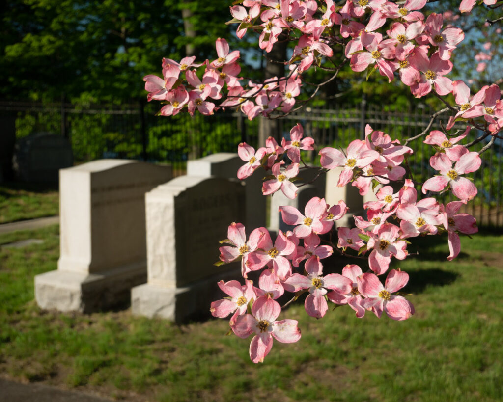
Ornamental flowering trees are commonly planted in many different spaces ranging from residential gardens to corporate office parks. One category that commonly hosts plantings of beautiful trees is cemeteries. While it may seem odd to some people, I’ve seen people of all sorts and ages strolling through cemeteries, even having a picnic. Last weekend, I visited a cemetery in Wakefield. Although the crabapple trees had all dropped their colorful petals, I counted more than two dozen dogwood trees in bloom.

From that short excursion, I wanted to share a comparison of two images of the same tree but photographed with wide-angle lens and a telephoto lens. There are a few reasons why you might choose to use one or the other. When in doubt, shoot them both.
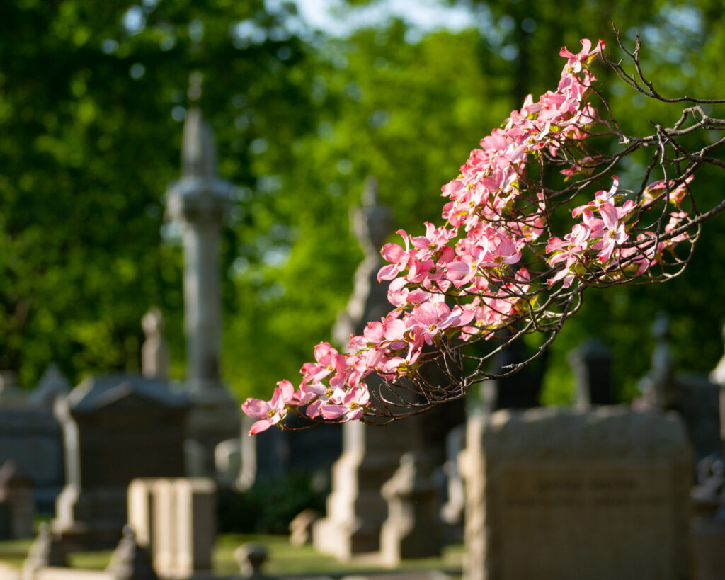
The first reason you might choose a telephoto lens is because you can’t get close enough to your subject. I personally encountered that scenario a couple weeks ago, stopping to photograph cherry trees in bloom at a cemetery where the gates were locked. I photographed from outside the fence using a 100mm lens.

The second reason you might choose to use a telephoto lens is to control the background. The narrow field of view may enable you to exclude elements from the background. And a wide-angle lens can include more background, for more environmental context. In the two photos I’ve shared here, both the telephoto and the wide-angle image do show the environment context, but a telephoto also allowed me to exclude the tombstones entirely.

A third reason to choose either telephoto or wide-angle is depth perception. Wide-angle lenses commonly exaggerate distance; multiple subjects in the photograph appear to be farther apart, compared to using a longer/telephoto focal length. Conversely, telephoto lenses tend to compress distance, making multiple subjects (at different distances from the camera) appear closer together.

Lastly, when you have multiple subjects at very different distances, a telephoto lens combined with a small aperture may allow blurring the background – if that’s the effect you’re seeking to create. Both the images here employ an aperture about f\4.5.
Gloves for Winter Photography

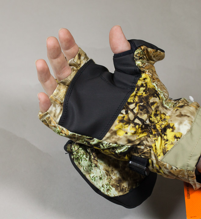
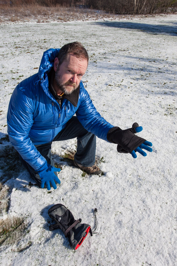
Author Kevin Davis with the Meteor Mitt by Outdoor Research

Operating a camera can be difficult (or impossible) while wearing gloves or mittens.  This problem is compounded if your fingers are very prone to becoming cold – perhaps your fingers get cold at a temperature that causes no trouble at all for some of your friends.  That’s the subject of my video: Gloves for Winter Photography.

Available products change every year; companies routinely invent new models and some older models may be discontinued. Of those that I have personally owned and used, here are my favorite lightweight gloves for mild temperatures (all are touch-screen compatible):

#3 REI: Grip Gloves
#2 Black Diamond: Powerweight Liner Series
#1 Burton: Screen Grab Liner

In the past ten days, I have twice used a glove seen in the video, a pop-finger fishing glove by Palmyth, which I paired with a touch-compatible glove liner. In advance of a snow forecast, I selected these gloves to wrap burlap around shrubs, a task that involves twine and tying knots. And for photography, I used these same gloves to pilot an aerial drone. With my fingertips covered merely by a glove liner, operating the touch-screen was beautifully easy. However, for a flight that lasted less than 15 minutes, my fingers soon became cold. As the air temperature was 33 degrees (f), this solution was barely adequate and would be a terrible choice for a shoot lasting an hour at that temperature.

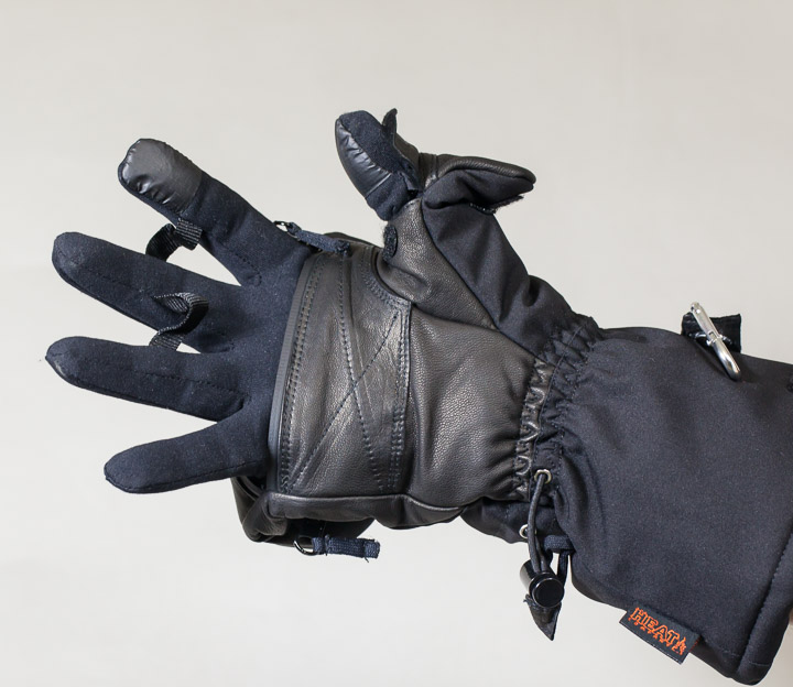
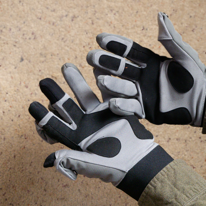
Shown here are a couple specific glove-mittens (a.k.a. glomitts) that I tried but personally decided that they didn’t measure up. Both include a pocket to hold a heat packet, which is a nice feature.

The first is an insulated glomitt from Cabellas. Unfortunately the finger openings were so snug that they could not accommodate a base-layer, a glove liner.  Since bare fingertips is not practical for my cold fingers, this product was unacceptable.

The second is an unusual full-finger glomitt, the Heat3 Smart glove. The interior glove and exterior mitten are fully integrated, the glove is not removable.  Having read very favorable reviews of this product, I tried it.  However, I was disappointed and promptly returned them. Considering the cost of these gloves is $150 (or more), I can get a battery-heated solution for about the same money.

Despite the exceptional construction, the shortcoming of this glove occurs when in half-mitten mode.  With the mitten folded back and fingers exposed, this product is no better than a lightweight glove. If I need an extended period of time making photographs (with the mitten folded back), it simply is not adequate.  A slightly better solution is a half-finger glove with a lightweight glove underneath; therein, the fingers below the knuckle have a double-layer while the fingertips have a single layer.

I must also note that the Heat3 Smart gloves include a magnet. That can be problematic; see tip #7 in my video about gloves.

Photography – Knowing Where To Stand

Photography – Knowing Where To Stand

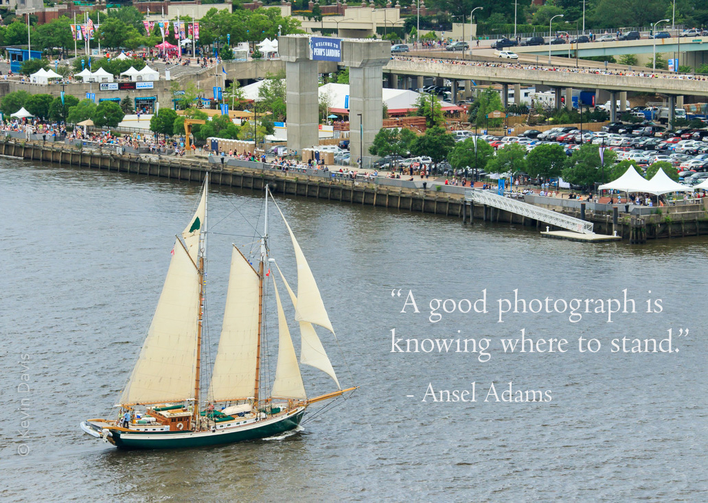
Schooner on the Delaware River, Phliadelphia PA


In this particular case, standing on a tall bridge (with pedestrian walkway) provided a spectacular view.

Where to stand?  I do ponder this question in advance whenever possible. But sometimes I don’t have detailed information in advance.   If I recall correctly, on the day of this parade of sail, I did not know precisely where the ships would be sailing and realized the potential of the bridge only that morning when I arrived at the waterfront.

The question of where to stand sometimes involves the location of the sun.  In the morning, sunlight will be coming from the east or southeast.  Later in the day, it comes from west or southwest.  That can be extremely important if my photographic expectations are front-light, back-light, or side-light.

A staged event, such as a parade of sail, will generally have a fixed start time that is outside of my control.  In that case, perhaps the biggest question is whether to stand on the left bank or the right bank.  For a recent Sail Boston event, I knew that the ships would be sailing into Boston Harbor through a channel between East Boston and South Boston; I had to choose one location, as travelling between the different locations was impractical.


Tree Silhouette At Sunrise

Balsam Fir and sunrise (final)

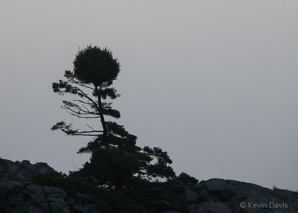
At 4:30am, I hiked out to the coastal headlands and arrived at White Head shortly before sunrise.  Although the weather was hazy, the pre-dawn light in the sky was interesting and beautiful.  As the sun rose to the horizon, the colors begain to fade and I believed the show was over, so abandoned my perch atop the cliff, 160 feet above the sea, and hiked north along the coast.

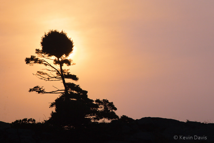
Fifteen minutes later, I spied this oddly shaped tree atop an exposed cliff and made the image shown here, a silhouette against a grey sky.

Balsam Fir silhouette

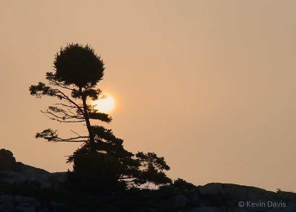
The hike to the north had brought me down to sea level and the cliffs now loomed above me. Unexpectedly, just to the left of the tree, the sun was beginning to rise behind the cliff.  The show wasn’t over yet.  The time was almost 6 a.m.

Scrambling along the coastal rocks, I positioned myself such that the tree was in front of the rising sun.  The second shot here is 15 minutes after the grey-sky shot.  Then, the final image is an additional 5 minutes later, about 6:20 a.m.

Balsam Fir and sunrise

Print Your Custom 12-month Wall Calendar

Print Your Custom 12-month Wall Calendar

Photography wall calendar

You can create your own custom books and wall calendars by uploading your photos to an on-line Print On Demand (POD) service, which prints the product and ships it to you. Order as few or as many copies as you like. This is in contrast to traditional offset printing which is used for print runs over 200 copies.

More than a year ago, I printed my calendar in two separate print runs, each with a different provider, VistaPrint and Photobook America. As the calendar was essentially identical, I can offer you an apples-to-apples comparison.

First off, I have to say that both calendars provided very good image quality. One was a touch better than the other – the color on the cover image is not perfect. But nobody would know without placing the two side by side.

The Photobook calendar includes 15 images, including front cover, rear cover, and a page (following December) which shows 12 months of the subsequent year. The VistaPrint calendar includes 13 images, including the front cover. Score one point for Photobook.

Both calendars are spiral-bound. When opened, a photo appears on the upper page and a one-month calendar on the lower page. The Photobook calendar pages are 8×11” and each one-month grid is 5” high by 9.75” wide. The VistaPrint pages are 8.5×11” and each one-month grid is 6” high by 9.25” wide. As this grid offers more space for writing, score one point for VistaPrint.

VistaPrint includes an easy to use interface for assigning holidays and other special days. Photobook does not. Score one point for VistaPrint.

In the October-November time frame, both companies offer promotional discounts that brought the price per calendar to less than $9 each. Don’t pay full price; discounts of 40% or more are quite common.

Waterworks – rowboat drifting

Drifting rowboat, Deer Isle Maine


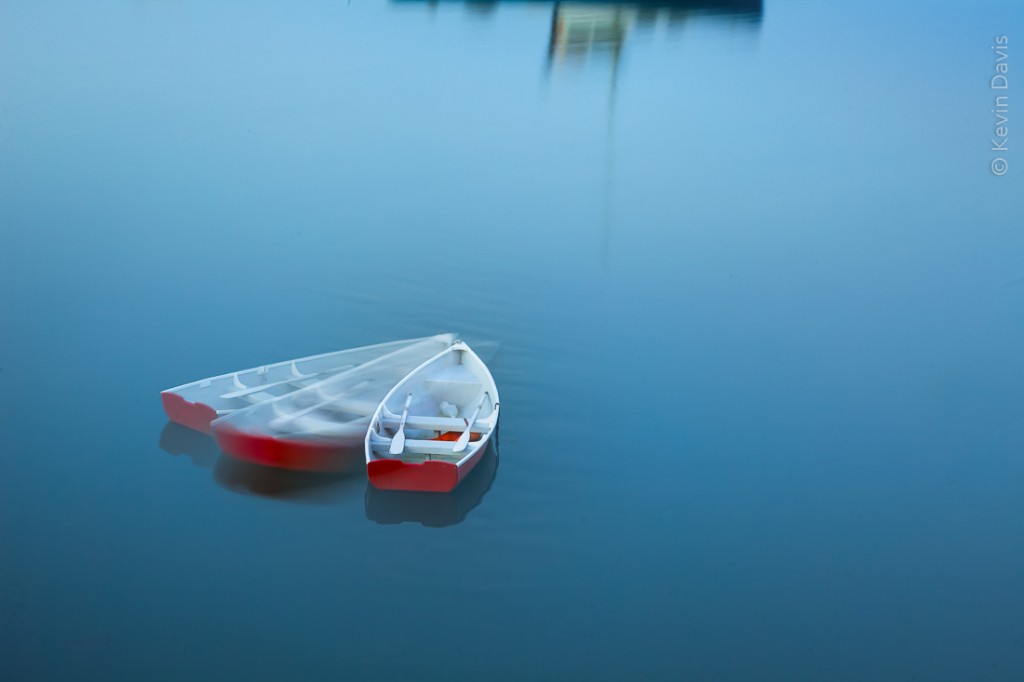
A print of this image will be exhibited in a juried art exhibit this month.  The framed print is 18×24 inches.  The uframed print is 12×18 inches (because that is what I can print on my 19″ Epson printer).

This is a composite of three images while the camera was fixed on a tripod.  As I was working, the row drifted around its mooring. The reflection at the top of the frame is from a lobster boat.  I feel that the lobster boat serves to anchor the image, while remaining abstract enough not to be a distraction.

The exhibit at Maryland Federated Art is entitled “Waterworks”.   With a total of 580 pieces submitted, the jurors selected 54 for the exhibit.  I submitted two, one of which was selected.  Here is a link to all the works in the exhibit:
http://mdfedart.com/portfolio/49/

Winter Light (photography)

Winter Light (photography)

The grey season.  In the northeast, wintertime without snow is a drag, particularly for outdoor photographers.  I need some snow here.  Not just on the ground – we need snow sticking to tree branches.

This winter has brought a fair amount of precipitation, but it’s been rain rather than snow.  What little snow we’ve seen has quickly washed away as snow turned into rain. So here are a few shots from last winter.

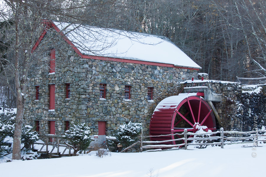
Old grist mill, in winter


The first is an old grist mill. It is pretty – I hope that much is obvious. However, the light may not be obvious. The orientation of the mill and surrounding trees doesn’t catch much direct sunlight. The sun is setting on the other side of those trees. The light is what it is and there’s no changing it.

In photography, we have to be aware of the orientation of the subject with regard to the light.   When the light on the subject is not what we would prefer, you can sometimes move the subject, but not if the subject is a building.  You can sometimes move the light, but not if the light happens to be the sun.  You might come back at a different time of day, when the sun is in a different position.  However, I believe this mill is in shadow of the trees both morning and evening.

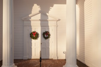
Church at sunset
Church at sunset

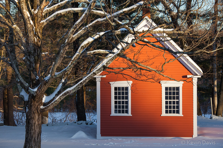
Sometimes, in outdoor photography, using only available light, there’s nothing you can do to change the light on the subject. But you might find a different subject to photograph. Across the street, a church was catching the light of the setting sun. So, I photographed the church. And next to the church is a historic one-room schoolhouse. Nice light, eh?


(To see a larger view, click on any image. )

One-room schoolhouse

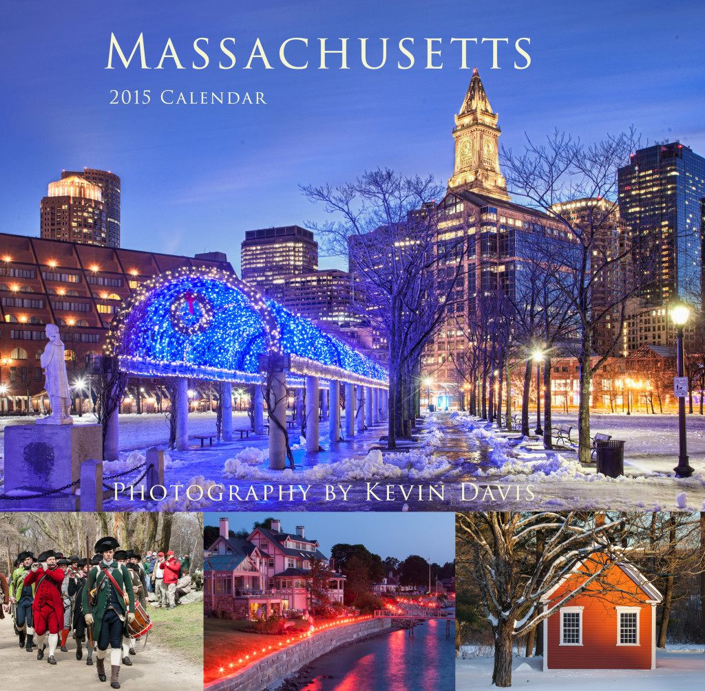
I included this last image (schoolhouse) in a recent 2015 wall calendar.

Wildlife Photography Workshop

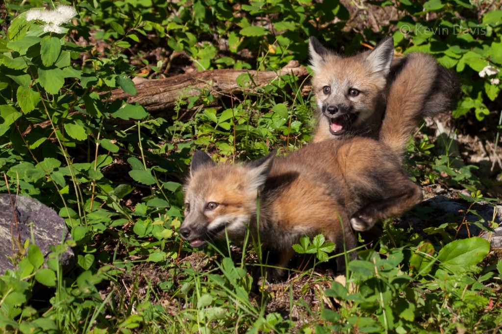
When I heard about this photography opportunity, I could not ignore it.  Everyone loves baby animals!  A 3-day workshop with leader Jeff Wendorff, to photograph baby animals at a game ranch in Montana.

Red Fox cubsWolf cubs, Red Fox cubs, Bobcat kits, a 4-month-old Tiger, and more.  The cuteness factor is very high.

I discovered limitations of my camera equipment that I had known before; particularly, my ability to quickly select a focus point.  In this regard, I have never considered the Canon 5D2 to be cumbersome, but I found here that the controls are not quite agile enough.   The common technique of focus, then recompose, takes 2 seconds and that’s not fast enough.  The wolf cubs were particularly difficult; they are very energetic and very fast.

All totaled, I shot somewhere around 3400 photos.  By comparison to some other folks, that’s not a lot.

After editing, I had fewer than 1000 images.  (I should probably do another round of editing and cut that number in half.)  Images were rejected for a variety of reasons.  Maybe my composition cut off the tip of a tail.  Maybe the animal’s ears were pointing in an odd way.  Sometimes there is nothing particularly wrong with the image, but I have a similar image that is slightly better.  Delete the weaker image because there is no point in keeping both images.

[ Click on either image to see a larger view. ]

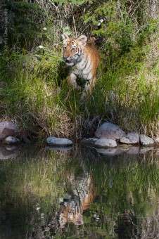
tiger reflectionThe workshop included a 4th day, just in case foul weather might interfere with the workshop, though this wasn’t necessary the week we were there.  So we had the option to photograph some other animals, including adult animals and a 1.5-year-old Grizzly Bear.

Of the 3.5 days, two days are jam-packed busy.  The other 1.5 days are still busy but not as exhausting.

Not only is Jeff Wendorff (jeffwendorff.com) an expert at photographing wildlife, but he also has an excellent relationship with the staff at the game ranch.

Photography Portfolio – part 2

Photography Portfolio – part 2

(This is the next installment following Photography Portfolio – part 1.)

Having sent out two sets of images, each to a different lab for printing,  I have received both sets of prints.  They all look great.  Both sets were printed on archival inkjet paper, but two different brands … Epson Premium Luster for the sports images and Museo Silver Rag for nature/landscape.  Premium luster is a lightly coated paper with a very slight pearl texture.  Although I have seen Museo Silver Rag referred to as luster, I am inclined to say that it is semi-matte (one notch below luster), with a subtle sheen and subtle paper texture.  The density of black color is not as good on Silver Rag (compared to the Epson Premium Luster), but is quite good considering this is an uncoated paper.  In retrospect, I am very happy with both choices.

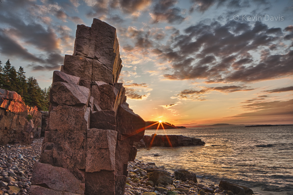
Acadia National Park


For sports images, I mounted each to a pure black presentation board.  The presentation boards were pre-cut to size and are solid black through the core.  From the print lab, each print had a broad white border; I trimmed down the borders to maybe 1/16 inch before mounting to boards.

For nature images, I did not want black or white, so I selected an off-white color mat board.  General-purpose mat board can be inexpensive, but depends upon the particular board.  Sheets 32×40” may cost less than $9. But this is only practical if you have the tools to easily and accurately cut the boards.

All said and done, including shipping, 32 prints cost me more than $400. Mounting boards cost an additional $1.20 – $2.00 per print.  A spray-can of adhesive can cost as little as $10 for non-archival and as much as $20 for acid-free archival.   Because a portfolio is not meant to last forever, there is no point in spending extra dollars for acid free adhesive or acid-free mounting boards.

Photography Portfolio – part 1

If you have a set of images, is that a gallery or a portfolio?  To my thinking a gallery can be any set of images, they need not even be related in any strong way.  In contrast, a portfolio is a very closely edited collection of 20-30 images, your very best.

A portfolio can be presented in many ways, but foremost in my mind are these four: contained in a book, individual prints, digitally on a web site, or digitally on a tablet computer.  Today, a professional photographer probably needs at least two of these four.  Most recently, I have been working on a print portfolio.  The last time I did this was years ago.  (I should probably burn those old prints because they cannot hold a candle to my recent work.)

The last time I created a print portfolio, the prints were all made on chromogenic paper … chemically treated paper that is light-sensitive and processed with chemicals to permanently fix the image onto the paper.  These types of prints are still very common, can be very inexpensive, and can create stunning images.   The image can be projected onto the paper either using traditional film enlargers or digital enlargers, such as a LightJet.  Chromogenic prints are continuous tone, unlike inkjet/giclée prints.

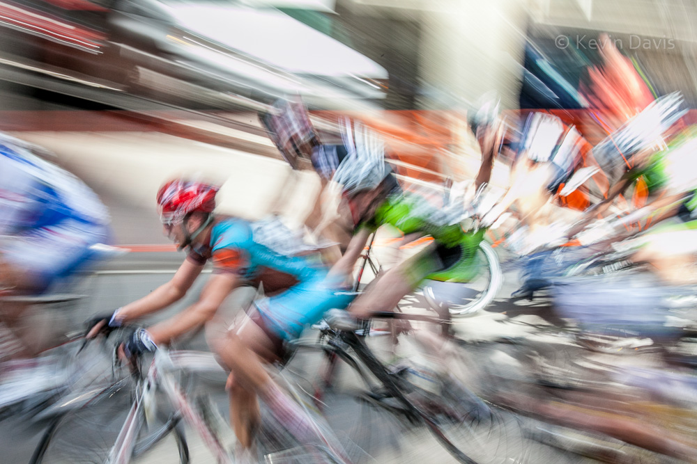
Bicycle race
Bicycle race

For my new portfolio, I am employing only giclée (a.k.a. inkjet) prints. These types of prints offer far more options with regard to the paper.  There are dozens of paper manufactures, each offering a variety of surfaces, textures, and contrast characteristics.  It’s all very confusing.  Photographers, who print often, have experience with several papers and have learned a few favorites for different types of images.  But that’s not me.

After a ton of research, I selected a specific paper and a lab that offered this paper at a reasonable price.  But before uploading my images to a print lab,  I thought to check the image via soft proofing.  Because printed images are dramatically different than images displayed on a computer monitor, soft proofing is a software feature that compensates for paper and ink, then shows on a computer monitor an approximation of what the print will look like.  I downloaded a color profile specifically for the paper I had intended to use, then displayed the soft proof using Adobe Lightroom.  The result was absolutely awful.  My best efforts were not enough to make the image look good, and I ultimately abandoned the paper, did more research, and selected a different paper.

Very briefly, let me say that a single print 11×14” or 8×12” can cost anywhere from $13 to $60, depending upon the particular lab, how much personalized care they give to each print, and the particular paper you choose.  (If you buy multiples of the same print, the additional copies typically cost less than the price for the first one.)  Compare this to a print on chromogenic photo paper, which might cost only $4 to $15.

When I began to place my order for prints, they informed me that my preferred paper was no longer available. Again, I returned to research and selected a third paper.  Because the lab offered a specific set of papers, I limited myself to just those papers that this lab supported.  Having already uploaded my images to the lab, I spoke directly with someone at the lab, to confirm that my paper choice was right for these particular images.  (Specifically, I did not want glossy or matte, but rather something in between that would provide very good color saturation and contrast.)   Unfortunately, the lab also informed me that the prices advertised on their web site had all been changed recently (they had neglected to update the web site).  Despite the paper changes and price increases, I chose to stick with this particular lab rather than go back to research and look for another lab that might possibly be less expensive.

More to come . . . .