Mavic Drone Photography – Post-Processing

With all digital cameras, my general practice is to capture RAW images instead of JPEG. Particularly when photographing with DJI Mavic 3 aerial drone, I not only capture RAW but additionally I frequently utilize exposure bracketing and HDR post-processing.
Portland Maine

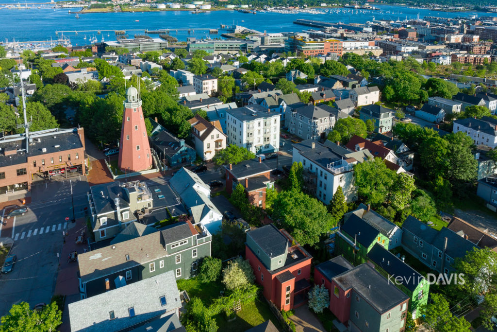
The image shown here is the result of post-processing with Adobe Photoshop.

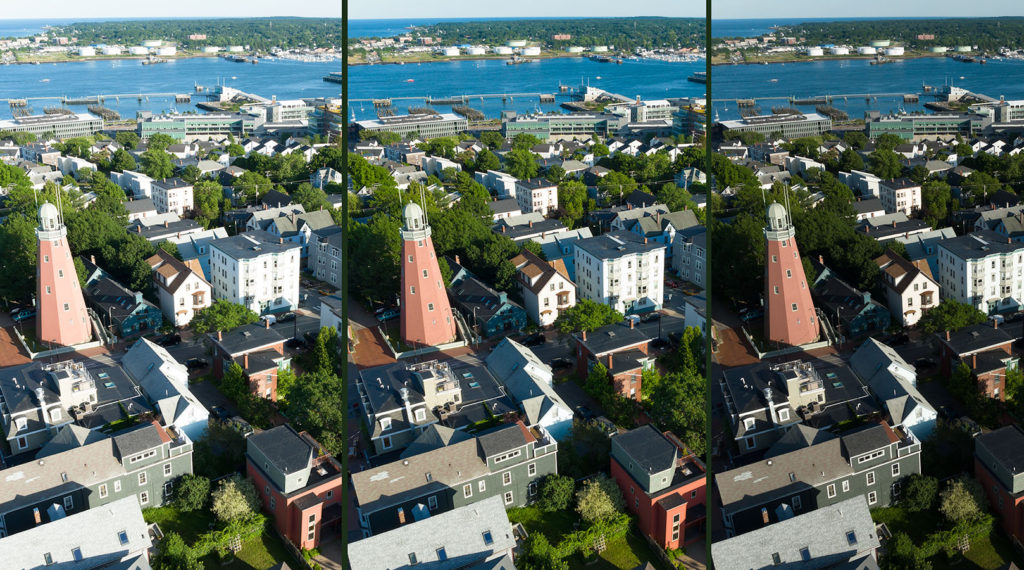
Having used the original DJI Mavic Pro, Mavic 2 pro, and Mavic 3, all have exhibited similar difficulty holding fine details in the highlights. This commonly occurs with architectural details under full sun; highlight details are easily lost. My solution is to use exposure bracketing and HDR post-processing; this means the original capture includes the best exposure, then two other exposures, one that is a bit brighter and one that is a bit darker. For the example, the photo here. I expected in advance that the highlights were at risk of getting lost; in retrospect, yes it was true.

The original three exposures are shown below. The best exposure is in the middle. As has been typical of Mavic 1,2, and 3, architectural details in white buildings have not been fully captured. The second problem is that the green trees are too dark. That second problem can be remedied in post-processing without much difficulty. However, if details in the highlights are blown out, recovering this can be difficult or impossible.
Initially, I perform basic adjustments in Adobe Lightroom and then open all three using “Open as layers in Photoshop”. That opens the three separate files as ProPhoto RGB (16-bit color depth) and with the adjustments made in Lightroom. Once opened in Photoshop, select all three layers and choose “Auto-align layers” in case the drone may have moved slightly between exposures. The best exposure I move to the bottom layer. From the other two exposures, I select specific parts of the image and these are overlayed over the bottom layer, effectively replacing problem areas.

Because the darkest exposure has retained all details in the highlights, I select the brightest areas from this exposure. Typically, this can be accomplished with either Photoshop’s built-in “Color range” selection. Once that selection is made, I often need to tweak it a bit, manually deselecting some areas that were selected but I don’t want those areas selected. Then feather the selection and convert it to a layer mask.

Using the brightest exposure, I similarly selected the green trees. That proved to be more difficult and I spent much time tweaking that selection. This selection is also converted to a layer mask. This replaces the overly dark trees in the base layer with a brighter version. Of course, you might use tools such as brightness or tone curve to lighten the trees in the base image, but the underexposed trees are more prone to luminance noise. Leveraging the brighter exposed trees does not suffer from noise, but is a bit more work to achieve.

There are alternative methods. I sometimes use Raya Pro by Jimmy McIntyre.

The final image is a composite assembled from three separate exposures of the same scene. I save this layered file as TIFF, but you can also save it as PSD (Photoshop format). I may merge all layers and export a JPEG file, but I keep the layered file. Commonly, I do return to this file and make further adjustments. For example, I may decide later that one or more of the exposures has noticeable noise or is not sufficiently sharp. The layered file allows me to make adjustments to the individual exposures.
Bread Art (Photographing Bread)

For the purpose of illustrating a theme, I was recently offered the task of photographing bread.

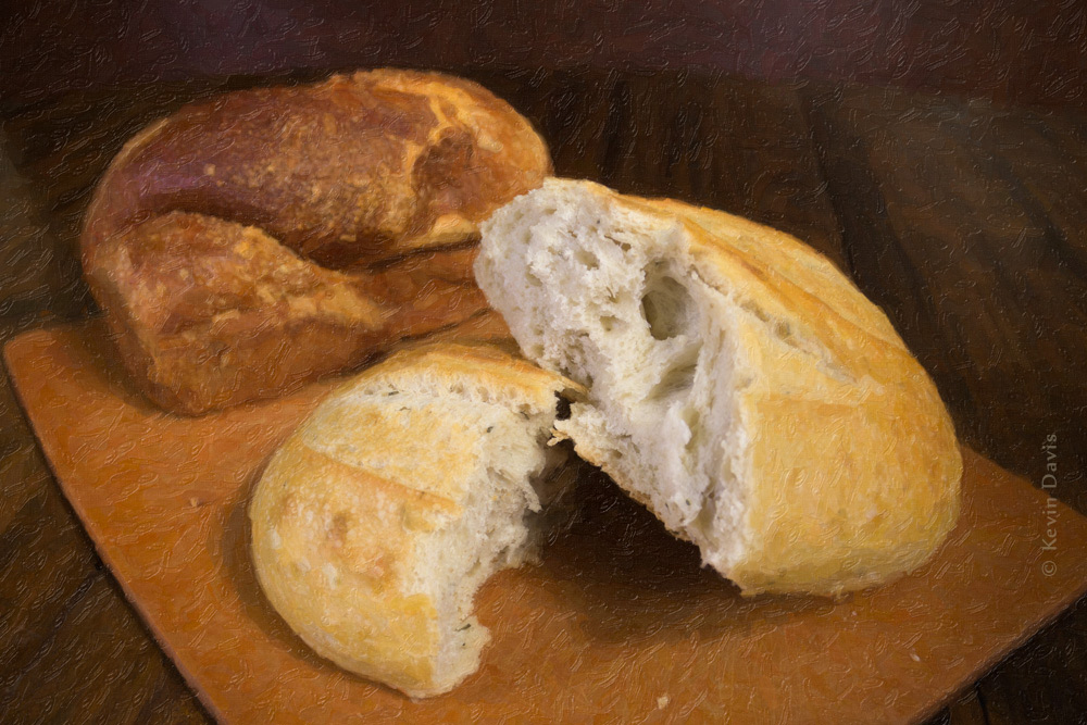
Final image (digitally modified using photoshop)

Here are the steps in making this image.

Although I originally thought this shoot might require actually baking my own bread, I quickly discarded that thought and went to my local market.  The market sells specialty loaves that are far more attractive than anything I can make.  So I purchased two different loaves of bread.

Initially, I photographed the unbroken/unsliced loaves.  Then I thought to slice the bread, but instead chose to tear it in half for a more natural look.  Good call.

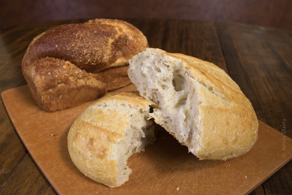
Original bread photo unmodified

After photographing for a half hour, this is the image I chose as the best.
Compare this original to the final image (shown before it).  For a larger view, click on either image.

In Photoshop, I copied the image onto two new layers and applied a different filter to each layer.  The first is a stylized using a plugin by Topaz Labs. But the effect is largely obscured by the next layer above it.

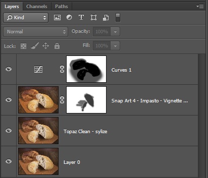
The next layer applies an artistic painting look using a plugin filter called Snap Art by Alien Skin.   Through the use of a layer mask, the effect is not applied to the inside of the bread loaf.  See the layers panel snapshot below.  Where the mask is dark, you see the underlying layer.

Finally, to highlight the bread, I created a darkened vignette using a curves layer.  The final image is shown at the beginning of this blog post.

U9A3235_bread_art-layersHere is a look at my layers in Photoshop.


Lightroom for mobile devices

THE must-have application for photographers, Adobe Lightroom, is now available for mobile devices.  The version for iOS devices (iPhone and iPad) is released and the version for Android devices is still in beta test.  The beta for Android devices is available to KelbyOne members (http://kelbyone.com/android/).

.   >>>       Review of Lightroom mobile edition

lightroom

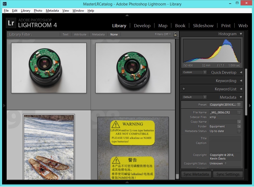
(Screenshot is from the desktop version and is a bit out-of-date, as the current version is Lightroom 5.)

Deeper Into Custom Books

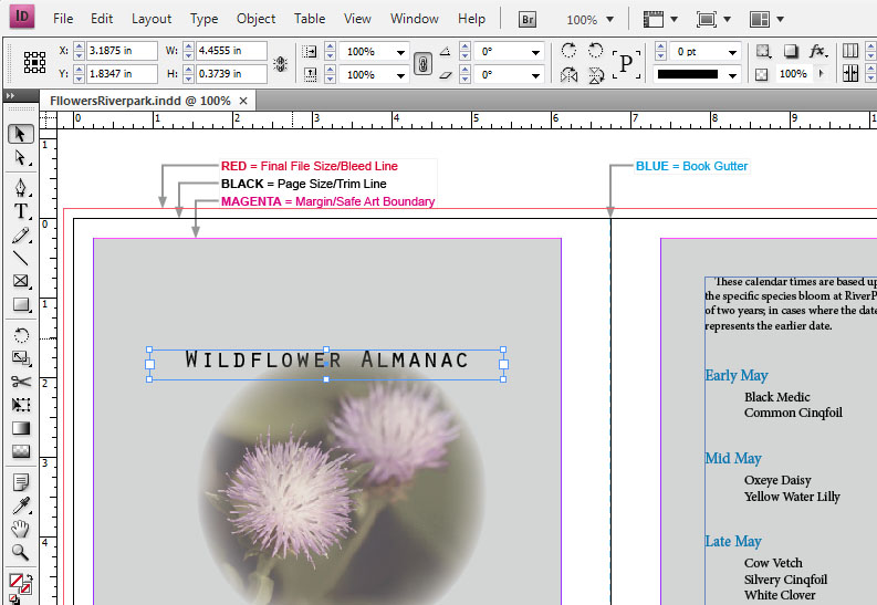
Typically, to create a print-on-demand custom photo-book, you download easy-to-use free software from the vendor/printer, layout your book pages, then upload the result for printing.  But, alternatively, some vendors allow you to use other page-layout software.  For my latest book, I used Adobe InDesign.

Having used the free software from three different vendors, I found them all quite similar and mostly intuitive to learn.  On the other hand, Adobe InDesign is just a bit more complicated to learn, but much more flexible.  If you can imagine it, you can do it.  For example, a frame can be virtually any shape at all (a frame is a container for text or images).  I used this flexibility several times throughout my book.

Adobe InDesign

There is one important difficulty to be aware of.  The printing equipment used to print your book is almost certainly based upon CMYK inks, not RGB.  All images must be converted to CMYK.  When you use free software (downloaded from your PoD vendor), this conversion is done automatically for you.  But when using other layout software, such as InDesign, you are responsible for doing conversion to CMYK.

Converting images from RGB to CMYK can be ugly.  The conversion will necessarily shift some colors.  And because CMYK is a smaller color space than RGB, some colors simply cannot be represented in CMYK. 

In the case of my recent book, Wildflowers of RiverPark, I converted each image to CMYK using Adobe Photoshop.  In general, rich green colors did not convert well to CMYK; no matter which conversion method I used, greens became horribly muted.  With practice, I learned how to compensate for this.  I was able to create a custom action to help this process, but it was still annoying and time consuming.  Furthermore, one image in particular features vivid purple-magenta (flower is Deptford Pink) that could not be represented in CMYK.

In doing the conversions myself, and using the soft-proof feature in Photoshop, I gained one important benefit.  The colors in the printed book are very accurate.  If you rely upon your PoD vendor to automatically convert your images, you may get some unexpected color shift in your final printed book.

Specifically using InDesign provides another small benefit: InDesign works well with Adobe Bridge and Photoshop.  From InDesign, create an emtpy frame, then hop over to Adobe Bridge, click on an image and choose: Place into InDesign.  The image is inserted into the frame you created.  After the image has been added to your book, making changes to the image is simple.  Right click on the image and choose: “Edit Original” to edit the image in Photoshop.  When you save your Photoshop changes, InDesign automatically picks up your changes and updates your InDesign document.